Seventh Graders just finished their color mixing project, and the results are stunning! Click Read More to see all of them and get an explanation of the project.
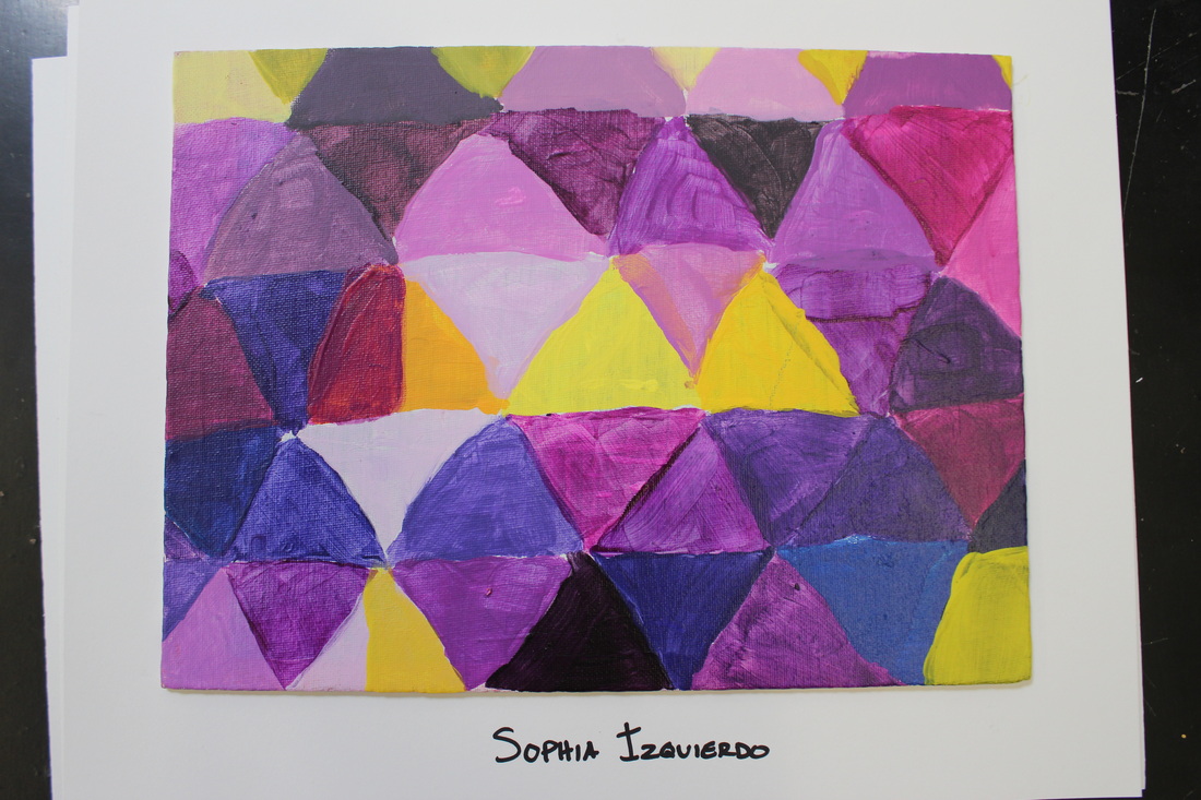
The focus of this lesson was color theory. We explored the great variety of hues that are available in the visible spectrum. The students were challenged to choose one base hue, then mix up as many variations of that hue as possible, and paint a little shape on their canvas with each. Then, the student mixed up a variety of shades of the color's complement, and painted about 10-15% of their canvas with that hue. Our focus was on Hue, Value, Color, and Complementary colors.
We looked at artists such as Josef Albers and Mark Rothco whose work is strongly dependent on our reactions to color and the way colors interact in the eye.
Color is such a funny thing which I think we often take for granted. It can change our perception of something, or make us agitated, or soothe us, depending on our reactions to the hue. When you put a color next to its complement, it changes.
 RSS Feed
